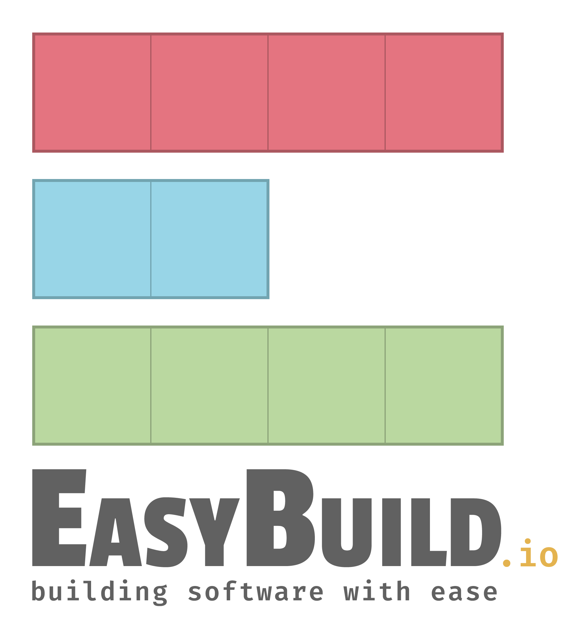
A new logo for EasyBuild (2022-11-14)
On 13 November 2022, it was exactly 10 years ago that EasyBuild v1.0 was released.
This called for a celebration. Or perhaps, something more than that...
Maybe it was time for something new, to refresh a particular aspect of EasyBuild that was due refreshing.
What if we could evolve a part of EasyBuild that could be significantly improved, and make the project
look a bit more professional?
How about... a new logo?
The original logo
In the process of publicly releasing EasyBuild in 2012, we came up with a logo ourselves. After a lot of discussion (and a couple of strong Belgian beers), we ended up with a logo "design" on a whiteboard. One of our team members took a picture of it, and traced it to obtain a vectorized version of it. There, we had our logo:

Not bad for a couple of semi-drunk Belgians, right?
Goals
We didn't just want any new EasyBuild logo: we wanted a fitting one, one that was easy to recognize.
And if this time it didn't look like it was drawn by a 5-year old, that was a plus, of course...
So, we defined a couple of requirements for the new logo:
- There should be a clear connection to the original logo;
- It should be distuinguishable, and work well on both light and dark backgrounds (like any good logo);
- Ideally, it features multiple aspects that clearly tie it to topics relevant to EasyBuild, like software installation, performance, community, the 3-level design of the project (framework, easyblocks, easyconfigs), ...
The result
A couple of weeks ago, an initial design of a new logo was presented to us.
It was not a an immediate success, which did not surprise us since it was difficult to disconnect ourselves
from the original logo after using it for over a decade.
After iterating over the initial design a bit by tweaking various aspects of it, and collecting feedback from
a couple of individuals, we ended up with a new EasyBuild logo that had our full support.

The new logo clearly meets the requirements we defined:
- It works well on both light and dark backgrounds, with minimal differences between the corresponding variants;
- Both the URL to the EasyBuild website and our infamous slogan are integrated in it, yet are easy to remove if deemed necessary without really harming the logo;
- It features multiple "blocks", which connects with both the original logo and the concept of easyblocks in EasyBuild;
- The colors of the blocks in the original logo are retained, in the same order, though in a softer pastel variant, which results in a more modern look;
- 3 rows of blocks are stacked on top of each other (and on top of 'EasyBuild', and our slogan), which matches both with the 3-level design of EasyBuild, and with the fact it is used to install software stacks;
- The rows of blocks collectively form a capital 'E', which is a nice touch;
- The color palette is inspired by syntax highlighting in a code editor, which compliments nicely with the camel-case spelling of 'EasyBuild' since that is the usual convention for class names in Python code (and it complies better with how we usually "spell" the project name than the original logo does);
- The rows of blocks can hint towards collaboration, which fits well with both the community aspect of the EasyBuild project, as well as corresponding to the fact that the EasyBuild framework (bottom row) consists of multiple subpackages that collectively provide required functionality, the easyblocks (middle row) that inherit from another to define the installation process, and the set of easyconfigs (top row) that are used to install a software application and all its required dependencies;
- In addition, the rows of blocks can also be interpreted as progress bars that show how far an installation has progressed, and be a hint towards the performance of software that is central to the EasyBuild project;
- In total, there are exactly 10 blocks in the logo, one for each year that EasyBuild has been publicly available so far. Coincidence? Maybe...
The initial feedback has been very positive, and we are extremely happy with how this whole ordeal worked out.
High-resolution and vectorized versions of the (old and) new EasyBuild logo are available at https://github.com/easybuilders/easybuild/tree/develop/logo.